Jardins Mirabel
Objective
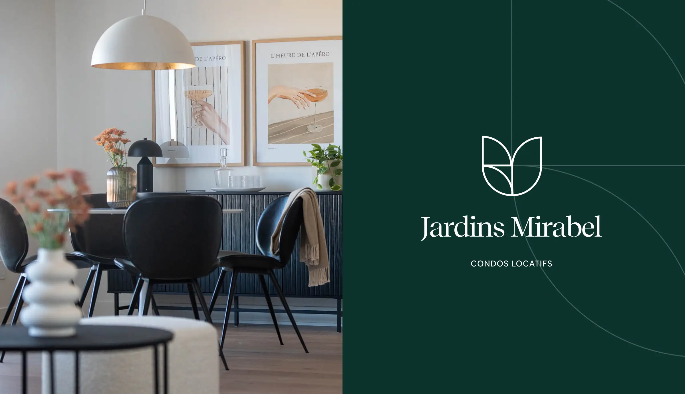
The mandate was to create a distinctive brand identity for Jardins Mirabel and extend it into a simple, cohesive digital presence. In a particularly active real estate market, the goal was to help the development stand out through a visual world that felt more elegant, inviting and evocative than the codes typically associated with rental properties.
Logo
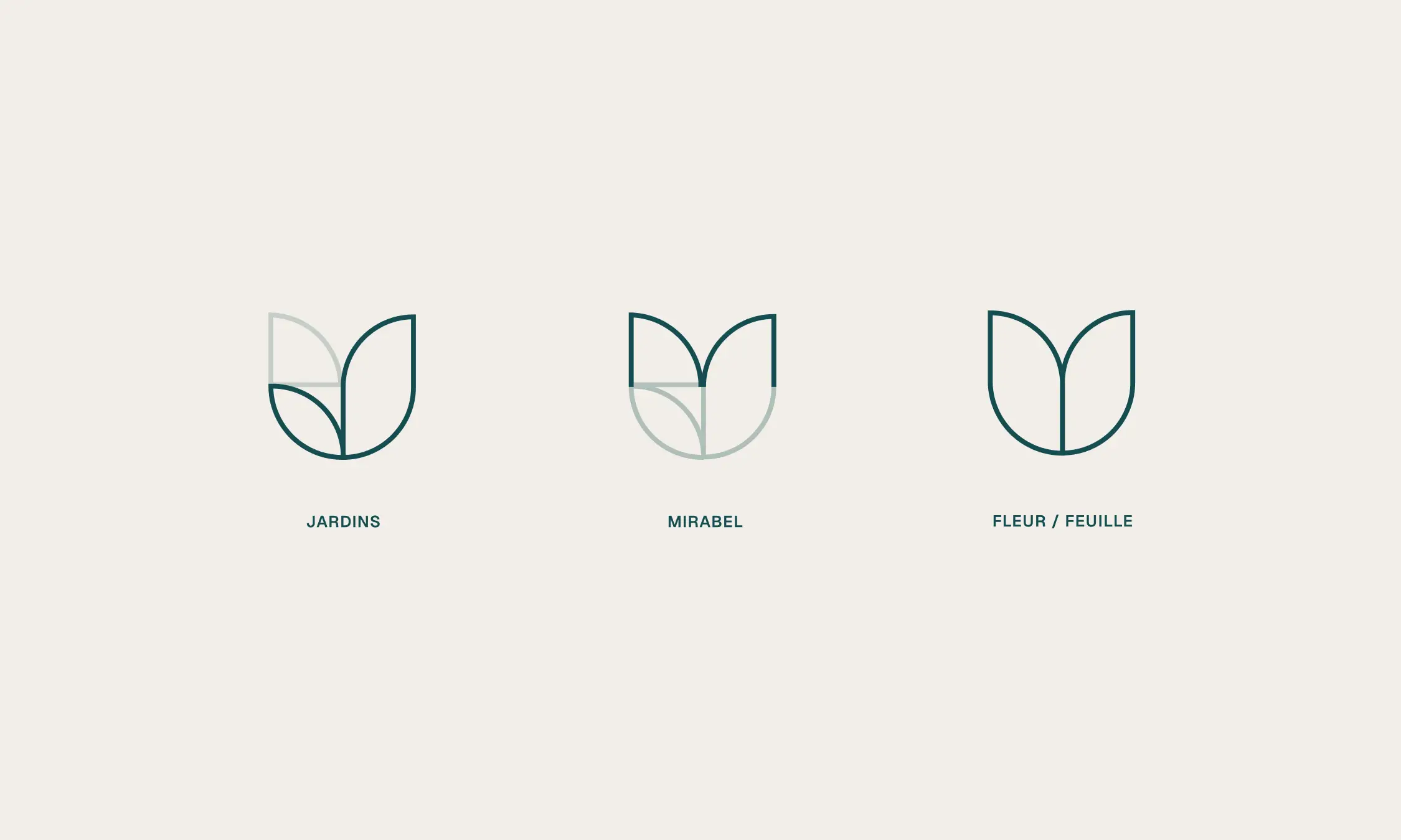
The identity is built around a refined symbol combining several ideas: the Jardins Mirabel initials, a leaf and a flower. Its geometric construction creates a signature that feels both organic and structured, echoing the connection between nature and modernity that defines the development.
Visual identity
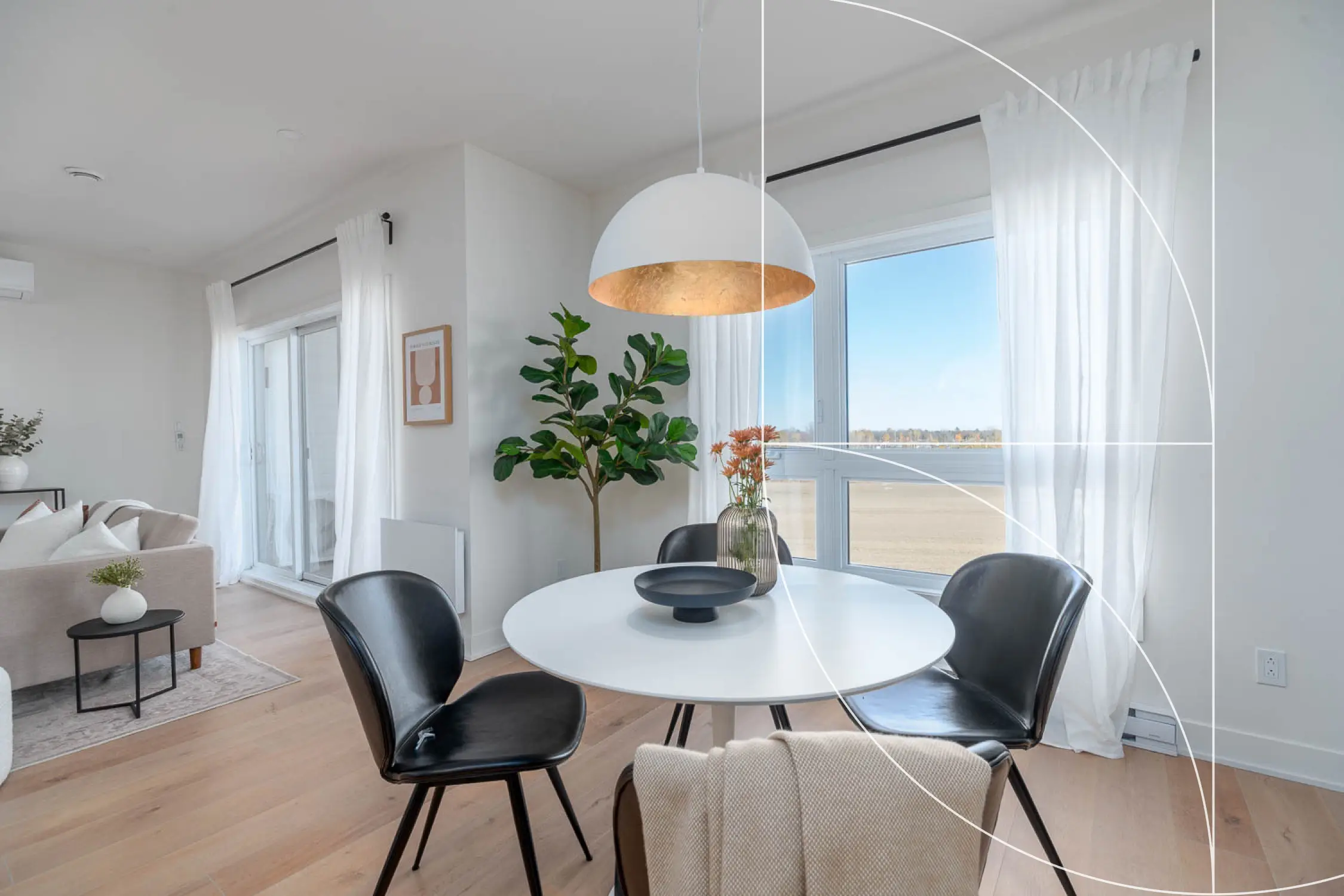
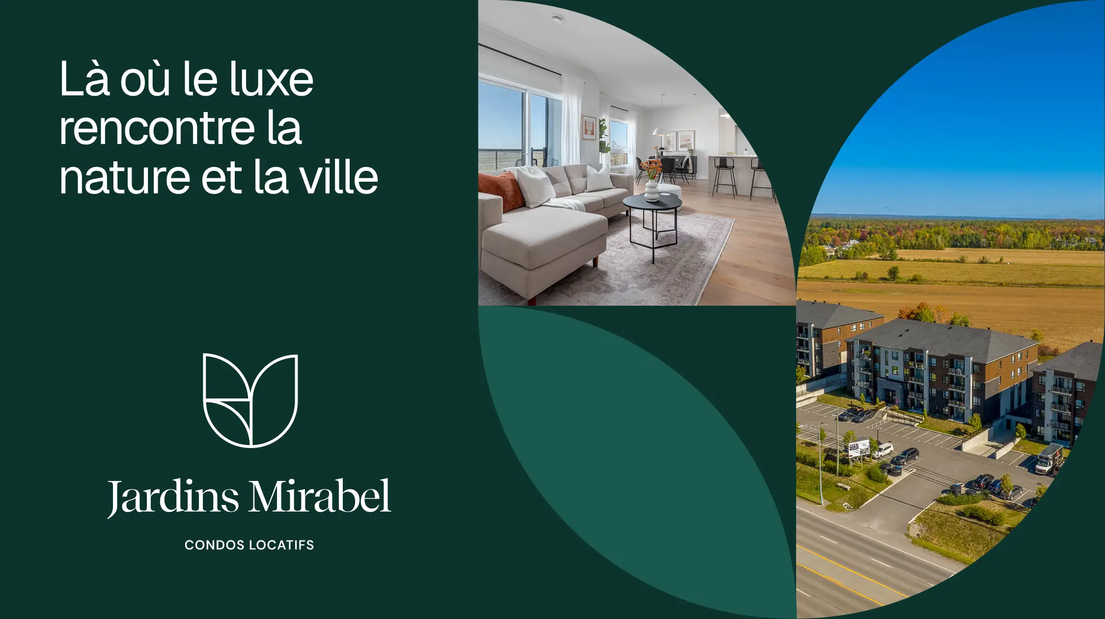
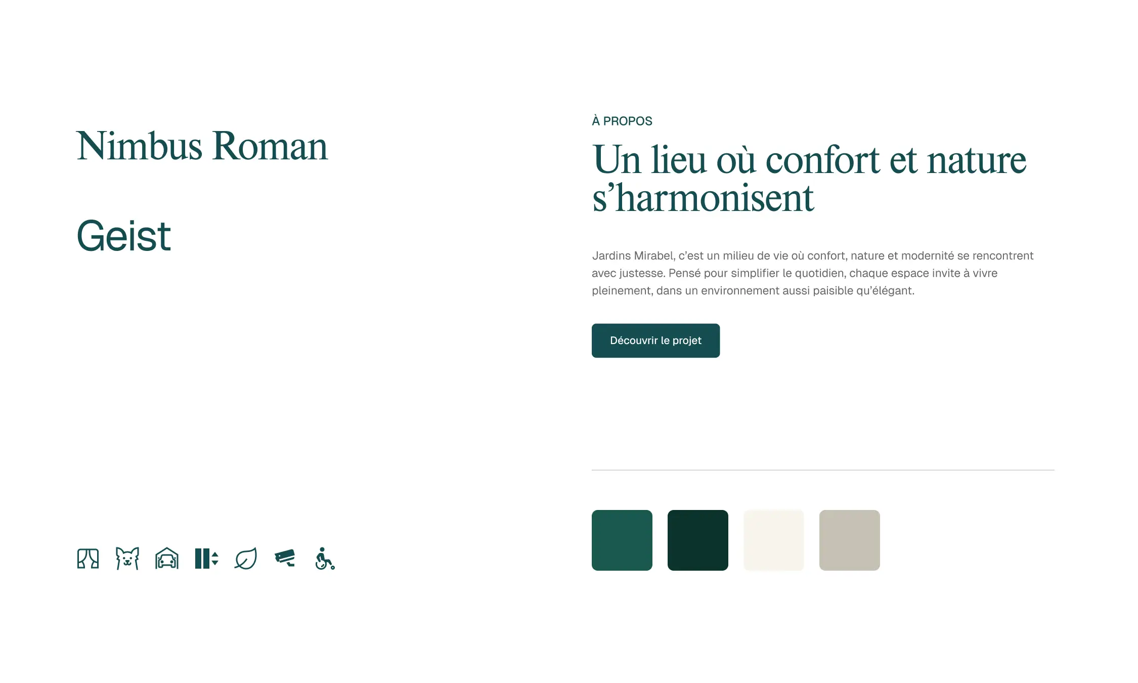
The deep green and cream colour palette creates a calm, sophisticated atmosphere. Pairing a serif typeface with a contemporary sans serif completes a visual language that is understated, welcoming and timeless. Curves derived from the symbol also become a distinctive graphic element, structuring the compositions and ensuring brand consistency across every touchpoint.

Digital presence
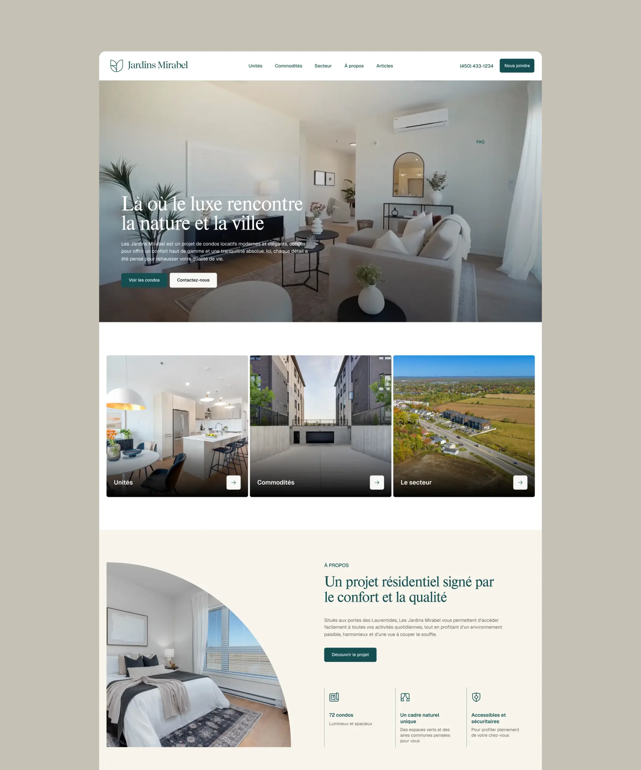
The Webflow website was designed as a natural extension of the brand identity. Our team also handled the copywriting, presenting the development, its units and its surroundings through clear, engaging language tailored to its target audience.
Discoverability
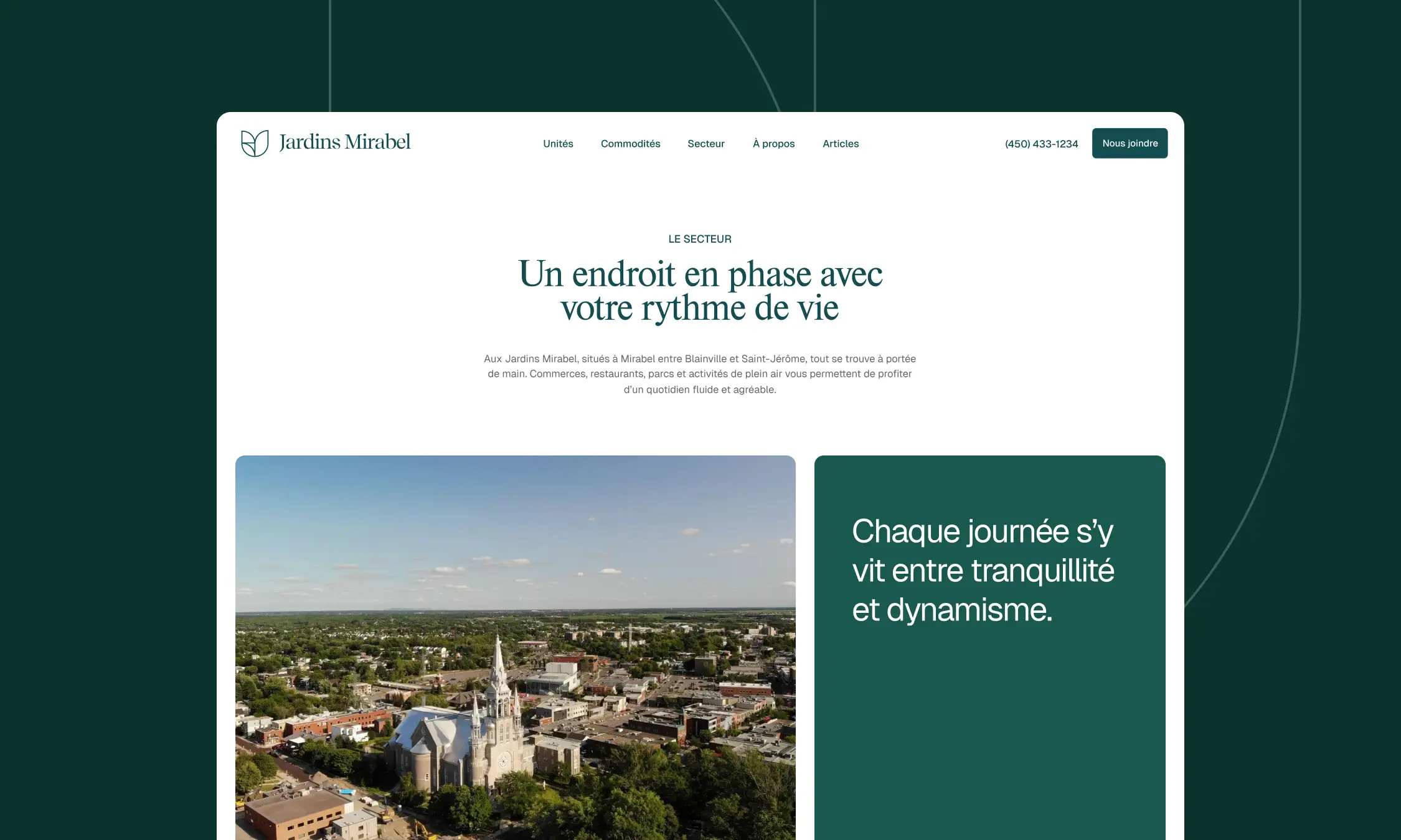
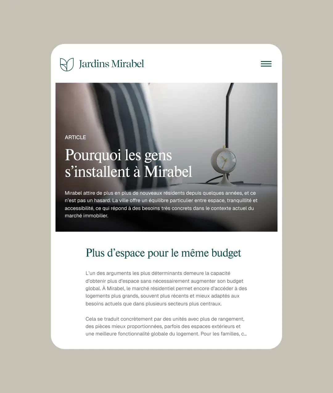
Particular attention was given to making the development easier to discover online. A comprehensive section dedicated to the surrounding area highlights local businesses, services, activities and attractions throughout Mirabel and the Laurentians. A blog also supports the website’s organic search visibility through content related to the region, lifestyle and the priorities of prospective residents. Together, the neighbourhood page and the community journal give the website a purpose that extends beyond simply showcasing the available units.
Floor plans
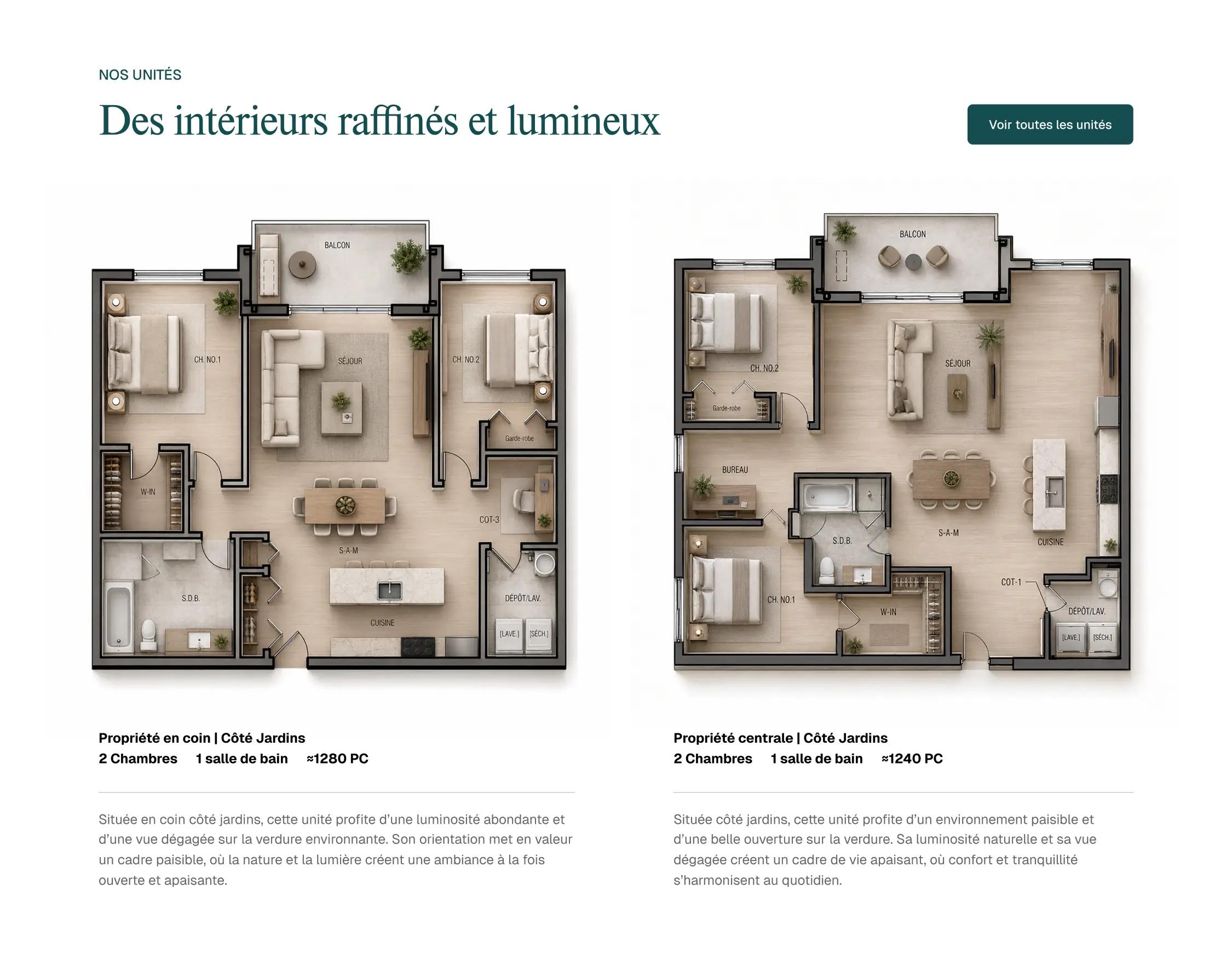
The condominium floor plans were also reworked using AI-assisted tools to create warmer, more realistic and easier-to-understand representations.
Result
Jardins Mirabel now has a distinctive and cohesive brand identity that reflects the balance of elegance, nature and simplicity at the heart of the development. Its digital presence provides a clear and engaging showcase while establishing a strong content foundation to improve visibility in a competitive real estate market.