Collège Sainte-Marcelline
Objective
The mandate was to modernize the College’s brand identity and digital presence to better reflect the quality of its educational approach, the forward-thinking nature of its programs and the richness of its community. This evolution needed to strengthen the College’s visibility among families while preserving its deep connection to its history and the Marcelline tradition.
Visual identity
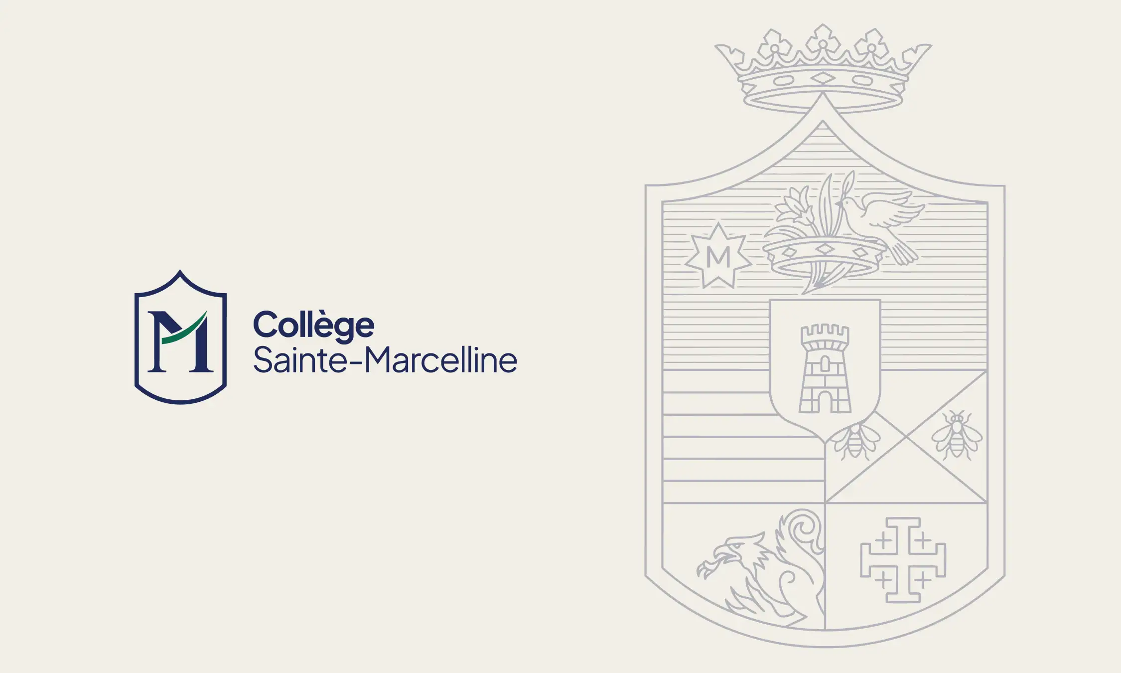
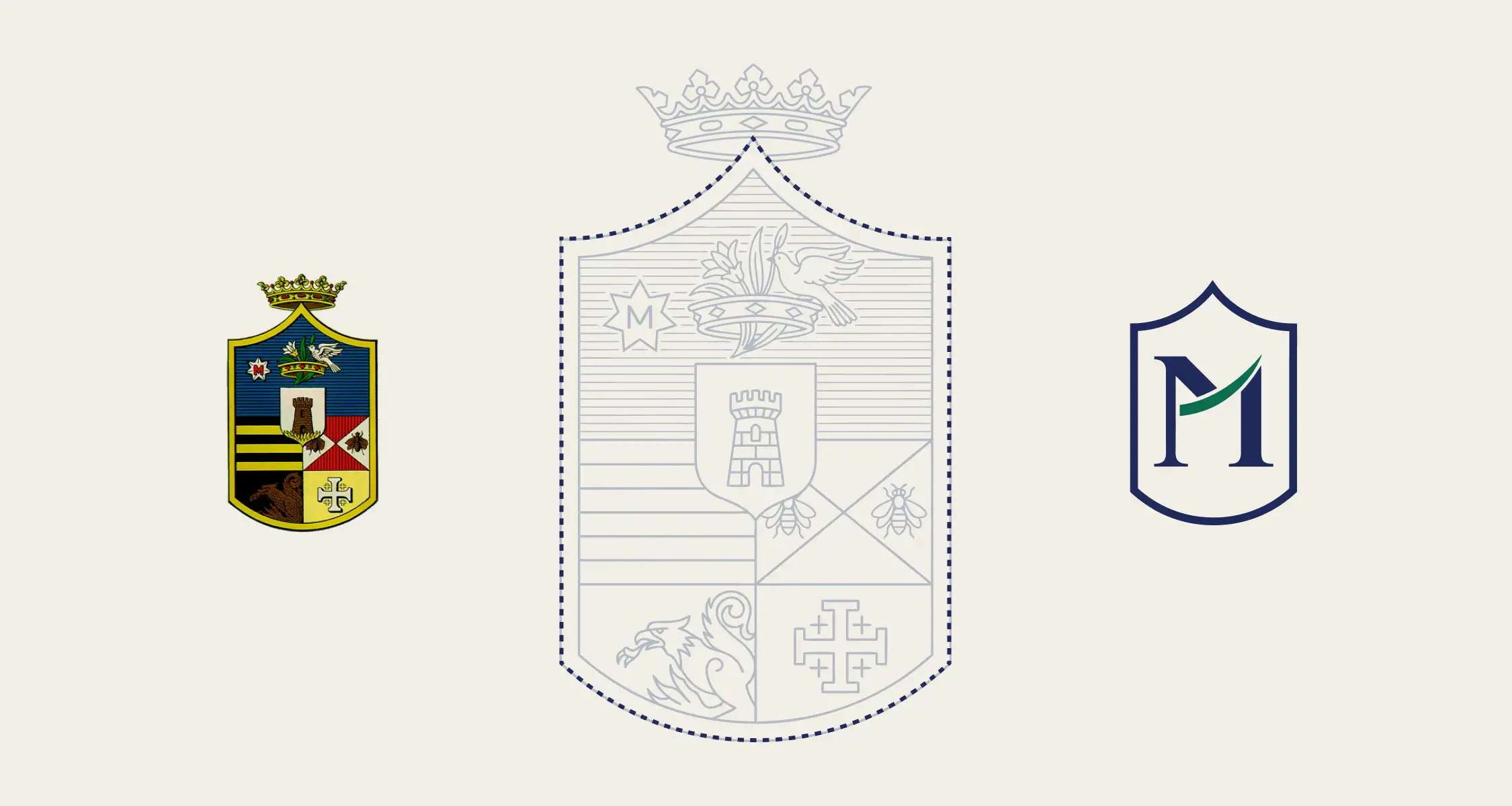
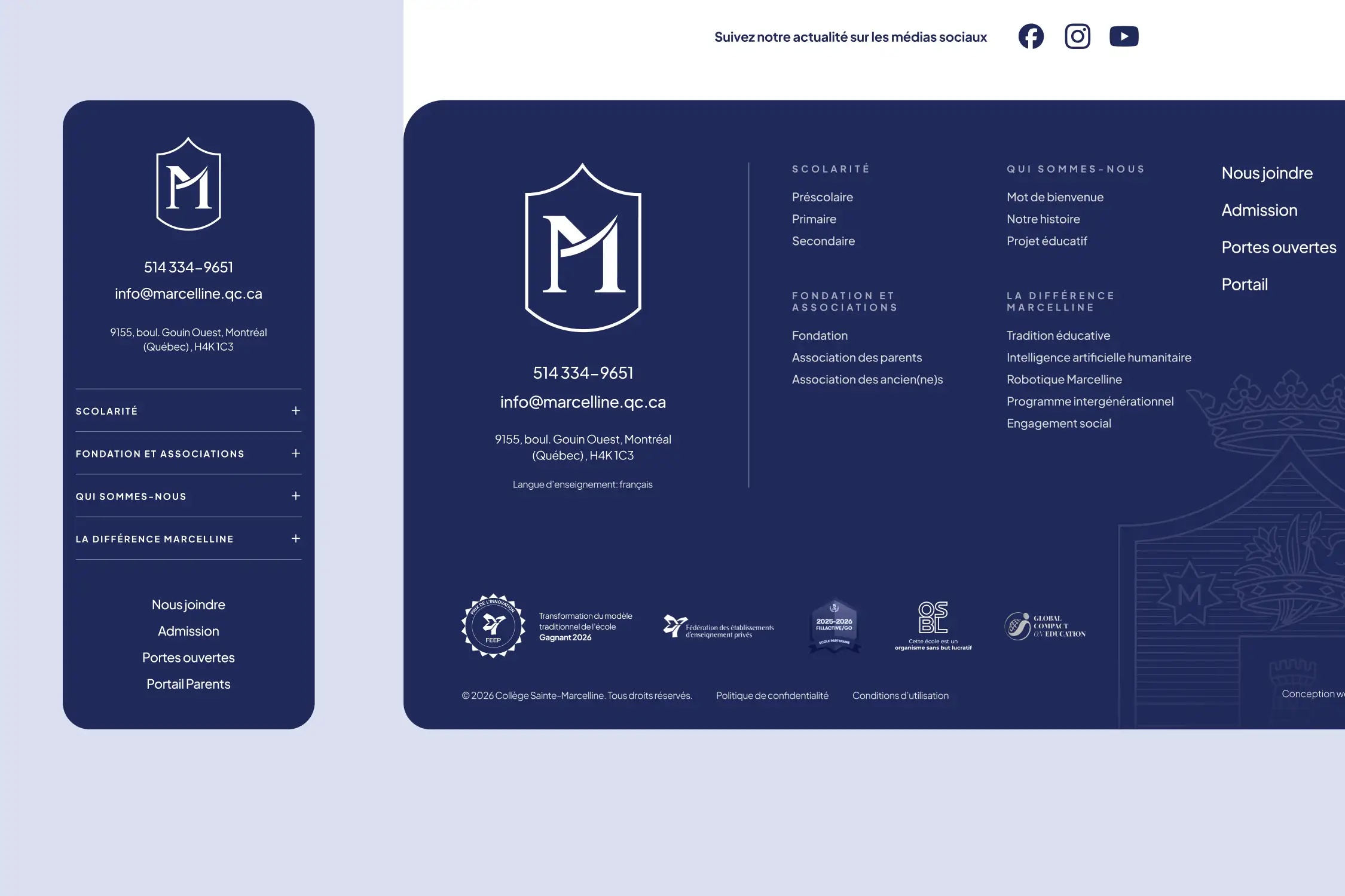
The logo was redesigned with continuity in mind. The shape of the new crest draws from the historic Marcelline symbol, while its refined treatment, typography and proportions give it a more contemporary presence suited to digital environments. A complete system of variations allows the identity to adapt to a wide range of communication needs. The historic crest also remains present as a subtle line illustration, creating a meaningful link between the institution’s roots and its new visual expression.
Visual style
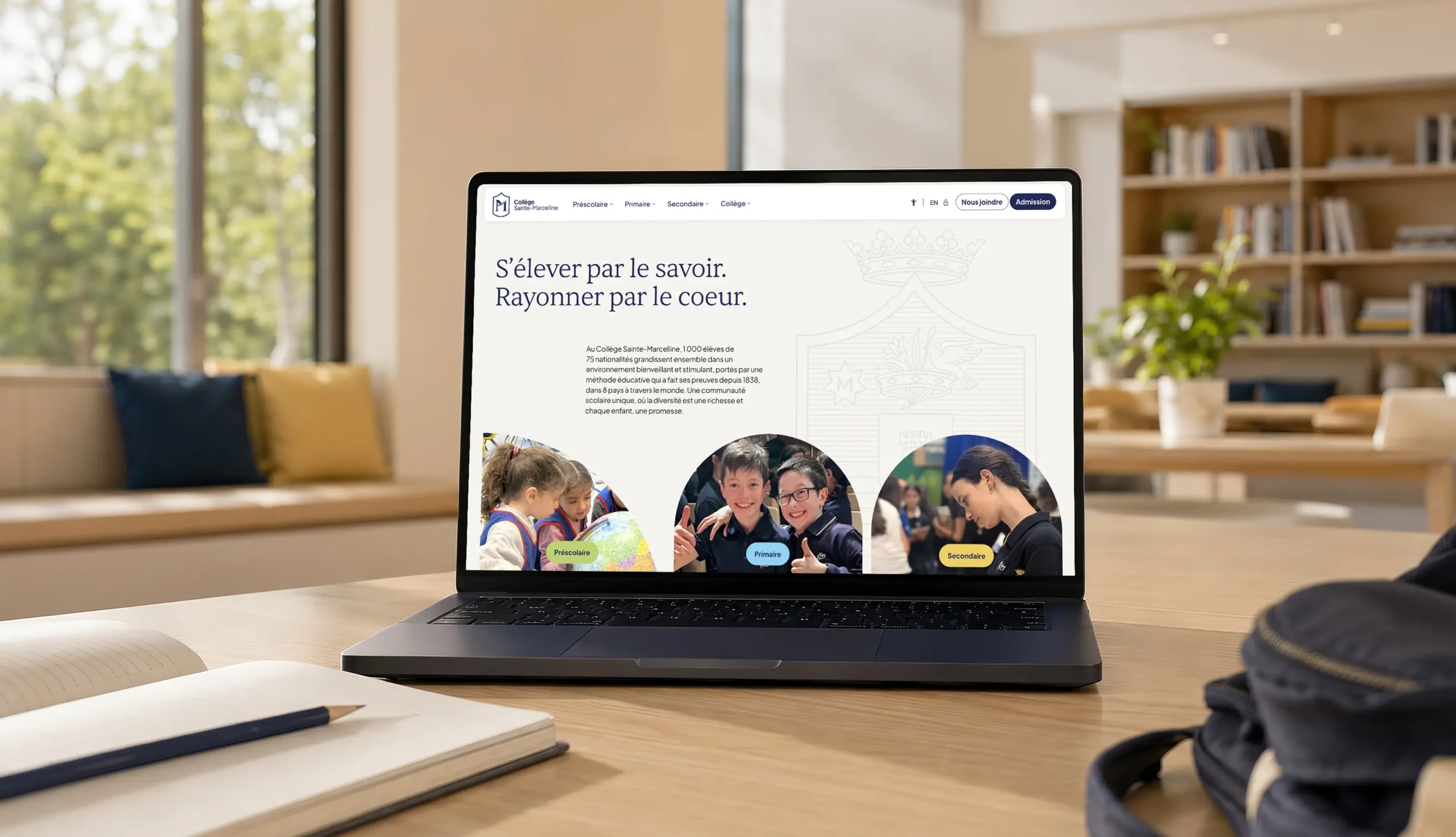
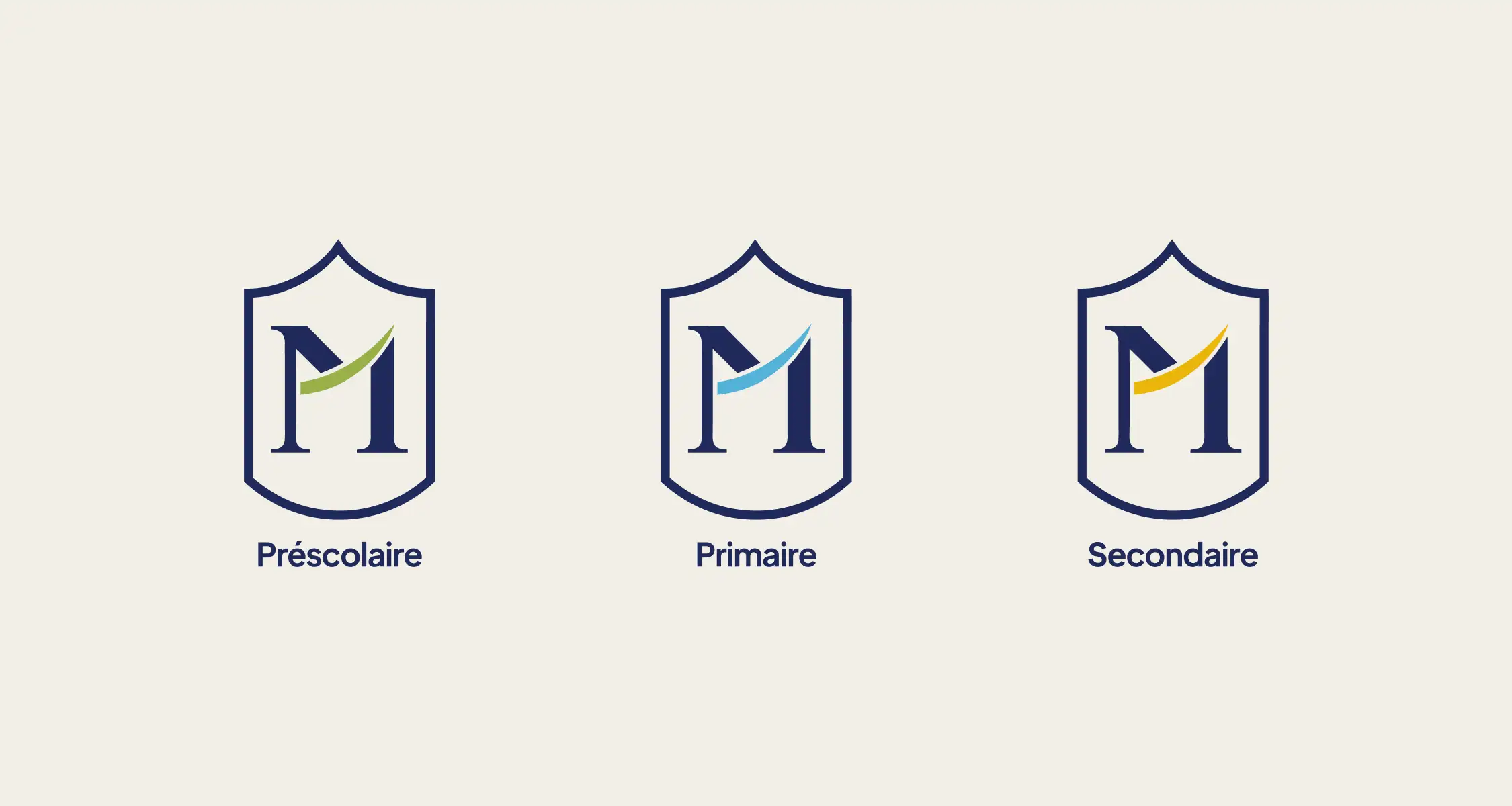
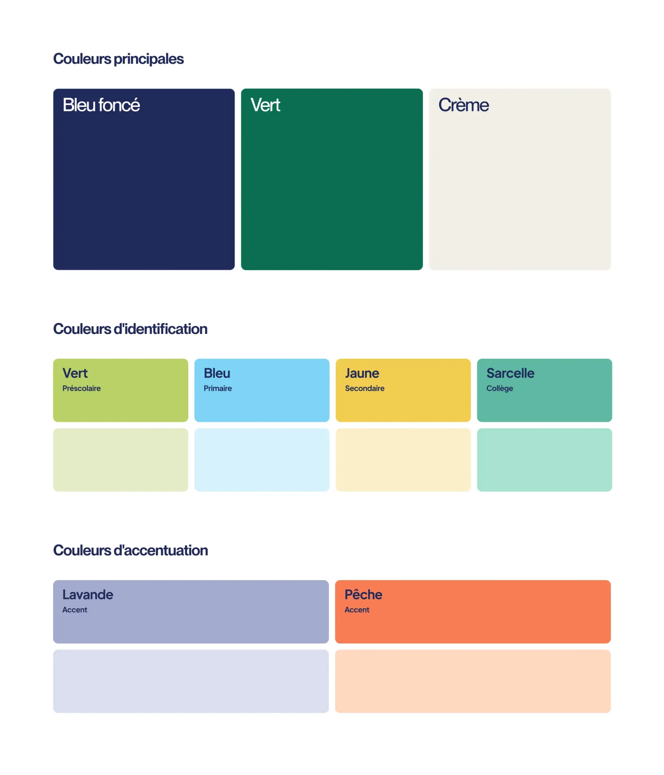
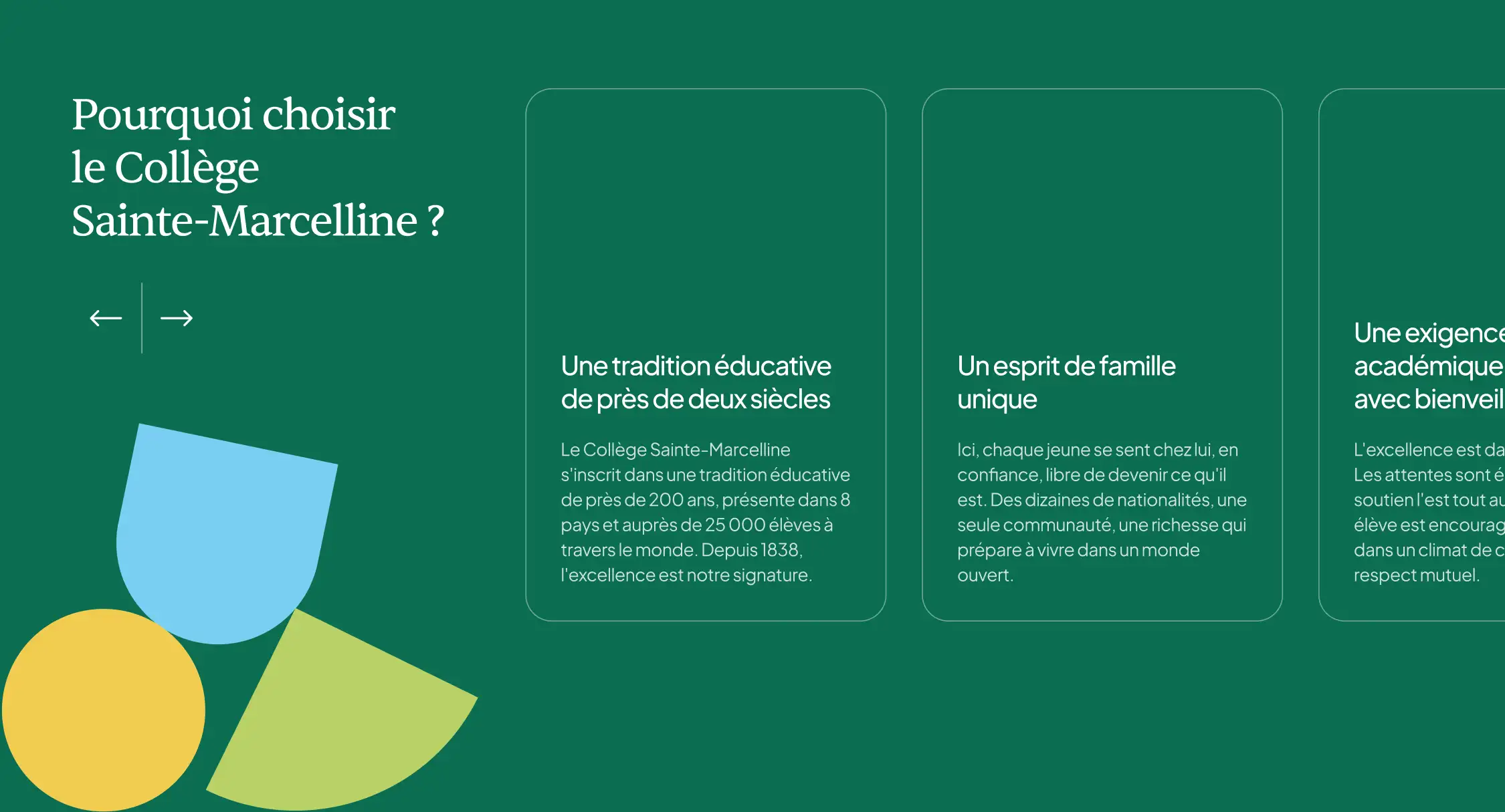
A distinctive colour palette was developed to identify each school level: green for preschool, blue for elementary school and yellow for secondary school. A teal shade brings together the College’s institutional communications. Organic shapes, rounded frames and spontaneous photographic compositions introduce warmth and movement into the visual language. They balance academic rigour with a more human, vibrant and accessible expression.
Information architecture
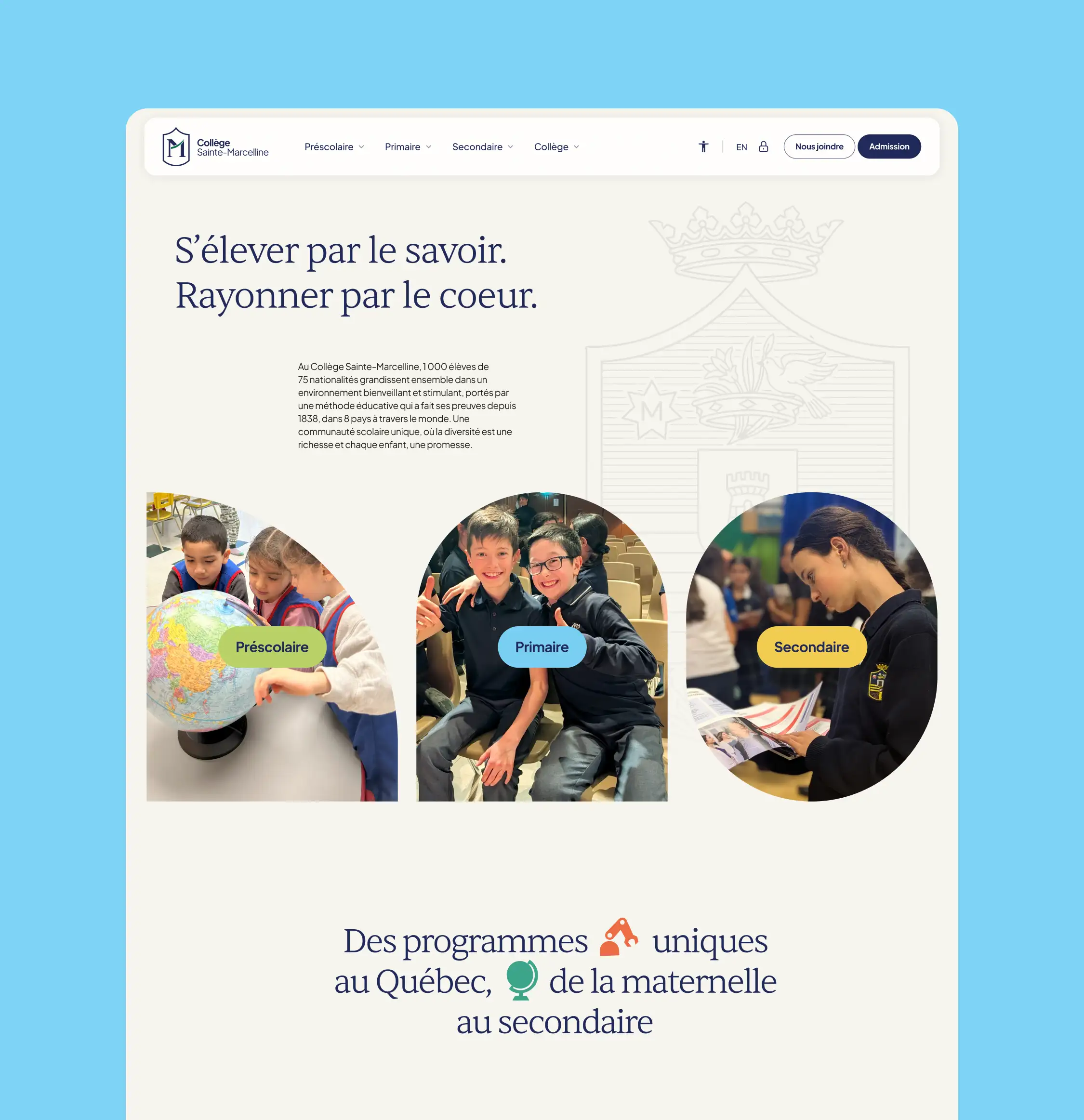
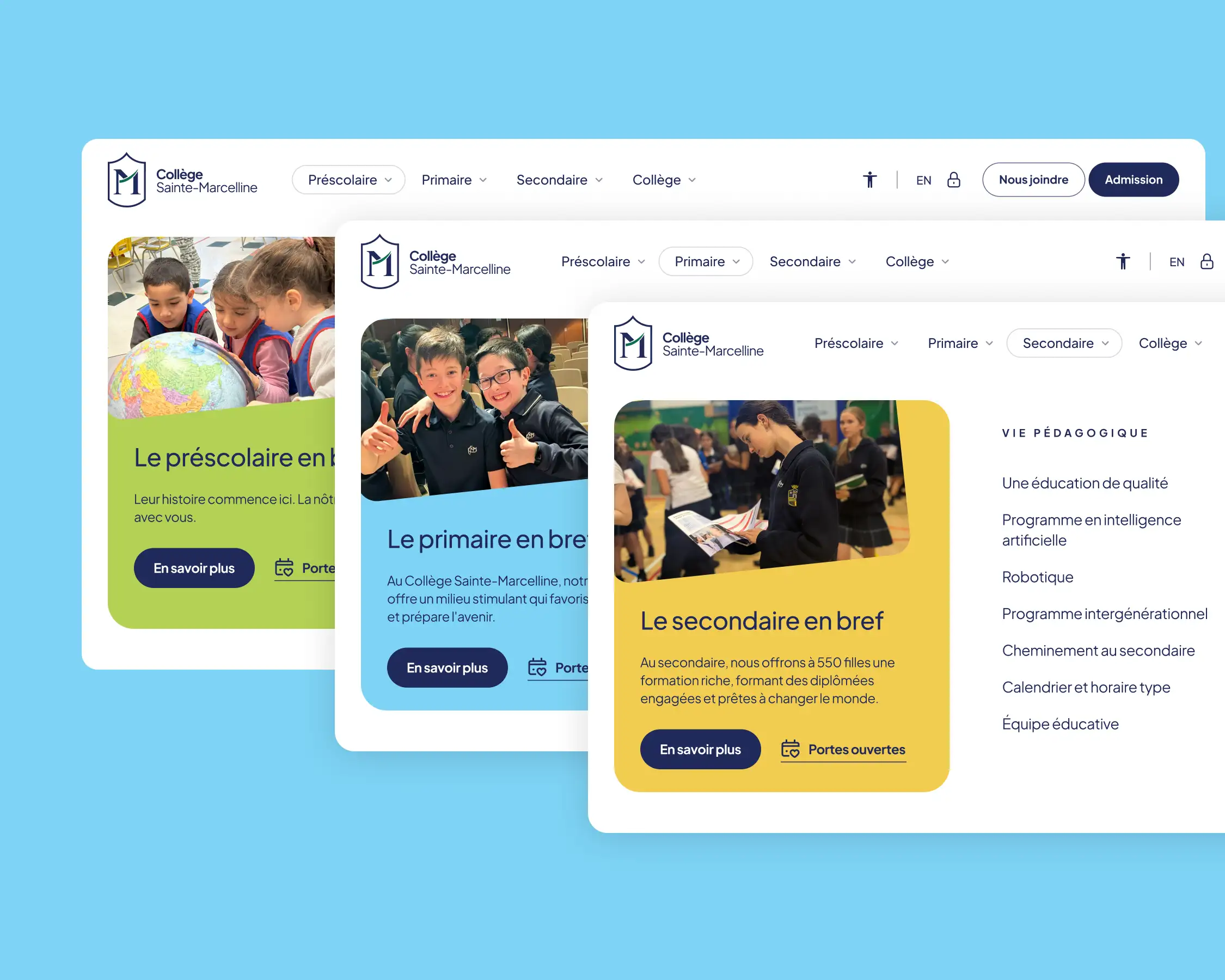
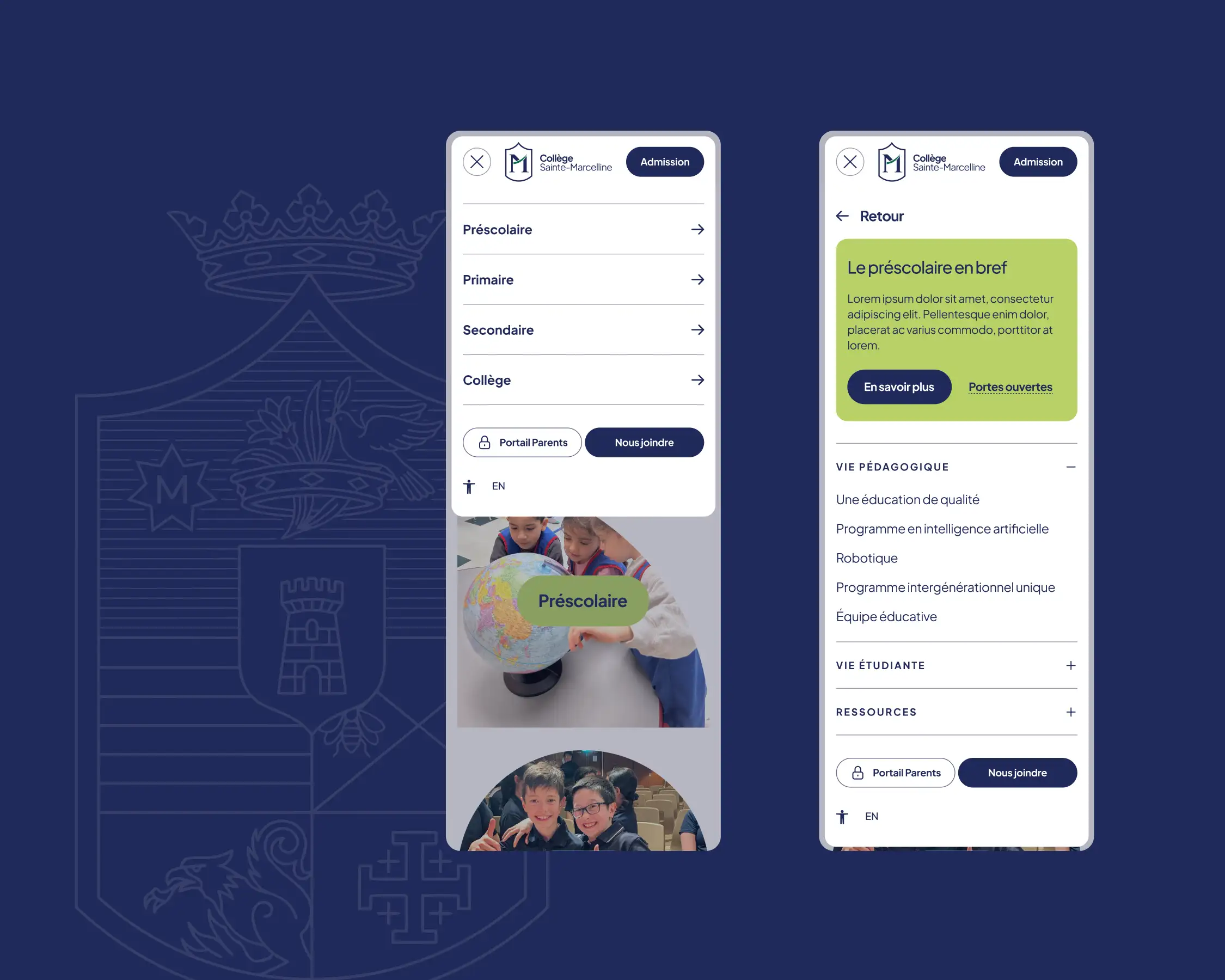
The site architecture was completely rethought to simplify access to a substantial amount of content. Its structure clearly distinguishes preschool, elementary and secondary school while bringing together shared information about student life, admissions and services. Large contextual menus help parents quickly understand the offering at each school level and directly access the content most relevant to their family.
User experience (UX)
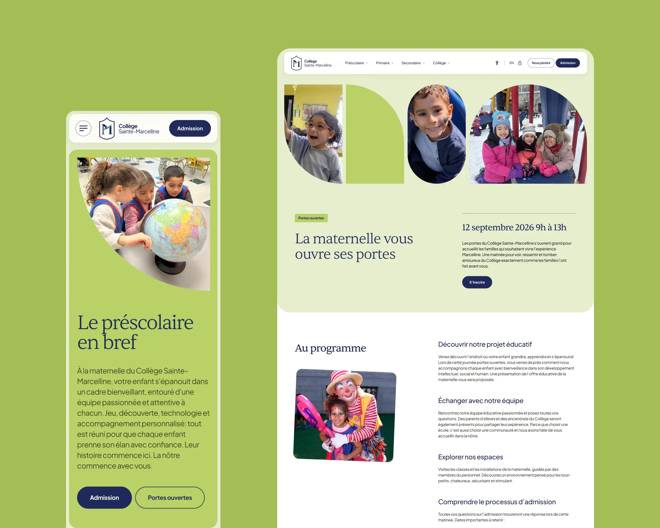
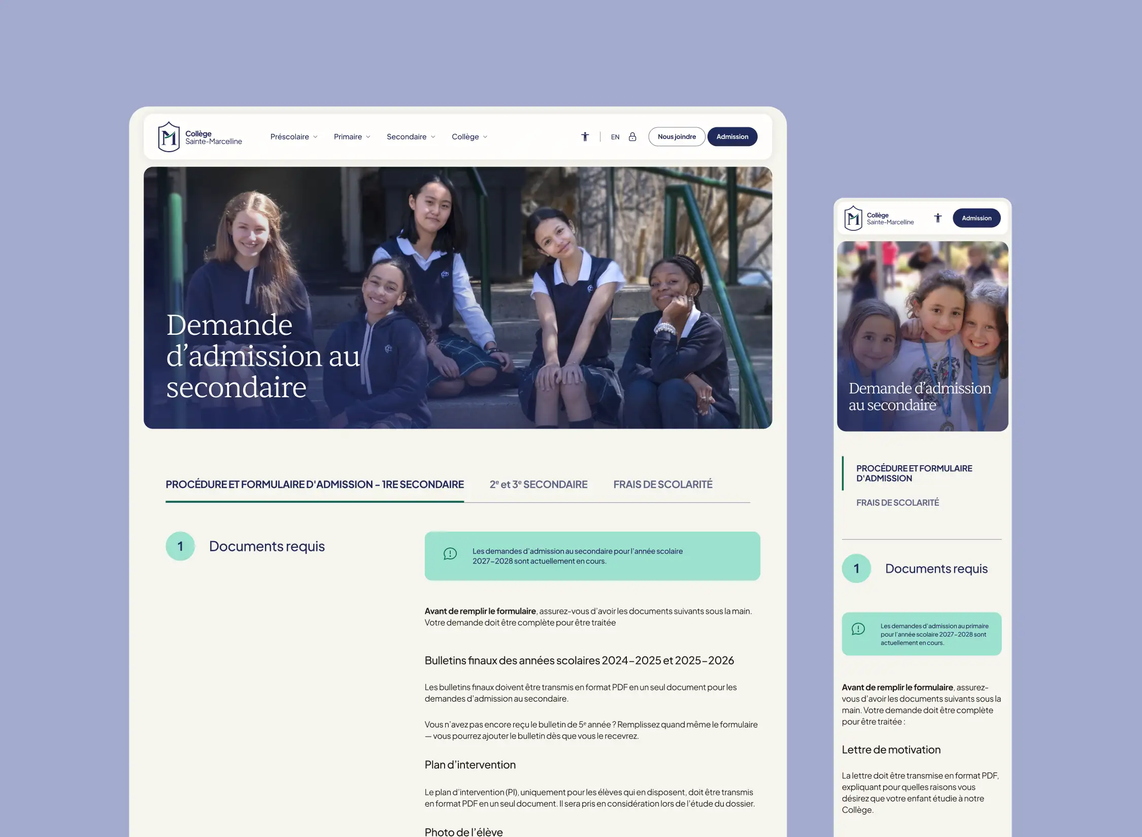
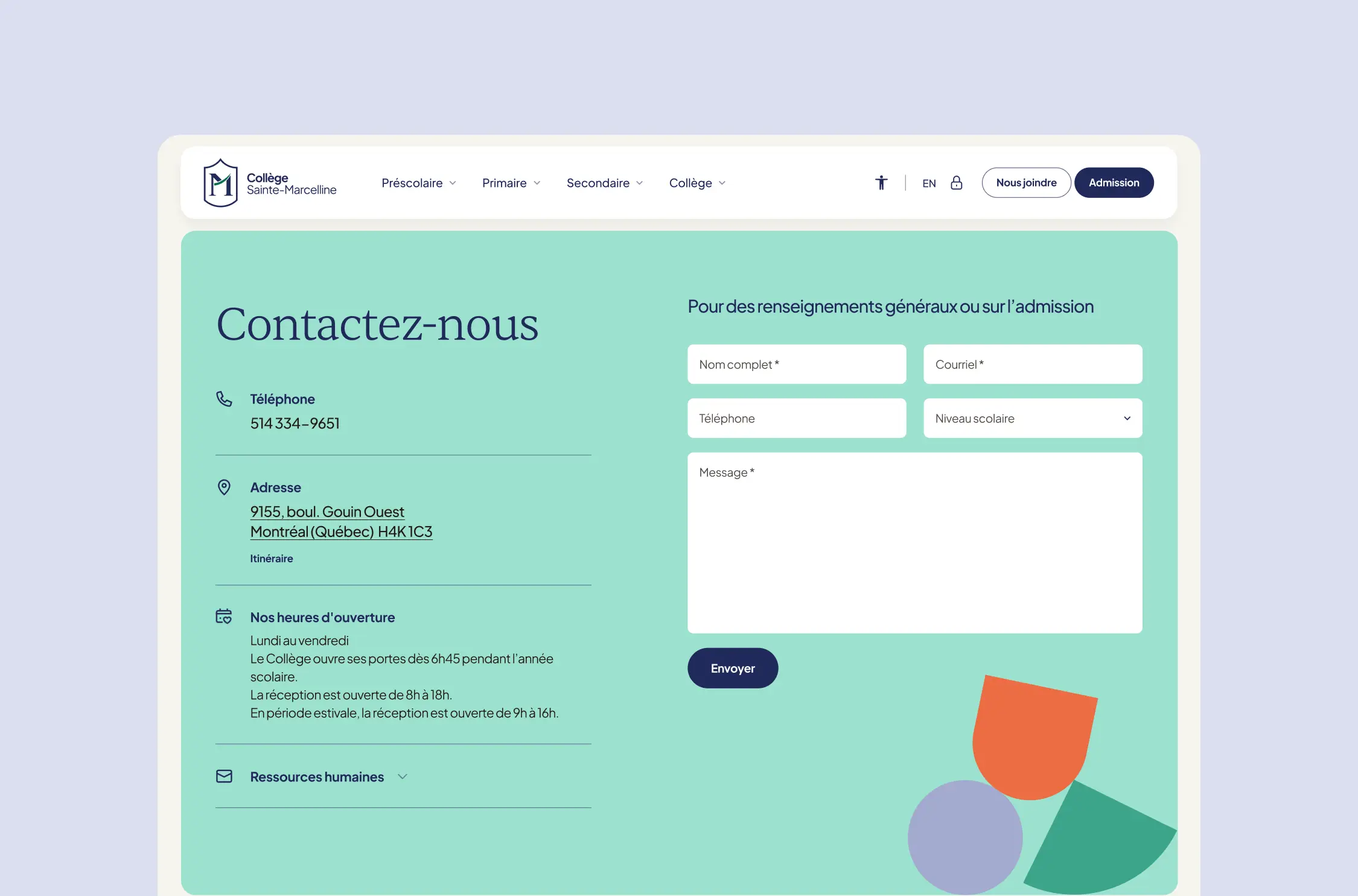
User journeys were designed around the needs of families, whether they are discovering the College or searching for specific information. Signature programs, admissions, open houses and essential resources remain readily accessible throughout the experience. Clear content hierarchy, prominent calls to action and frequently asked questions help support decision-making. Particular attention was also given to the mobile experience, now central to the way parents browse online.
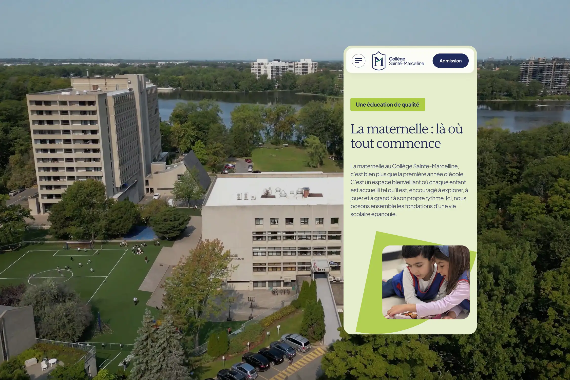
User interface design (UI)
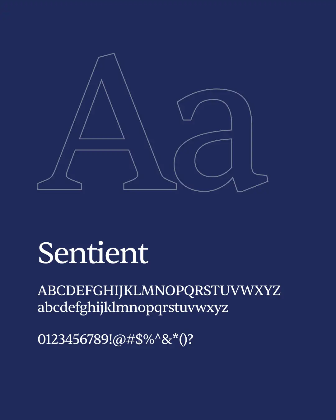
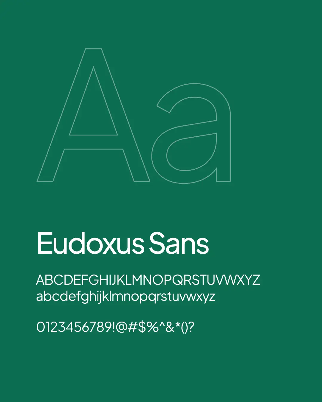
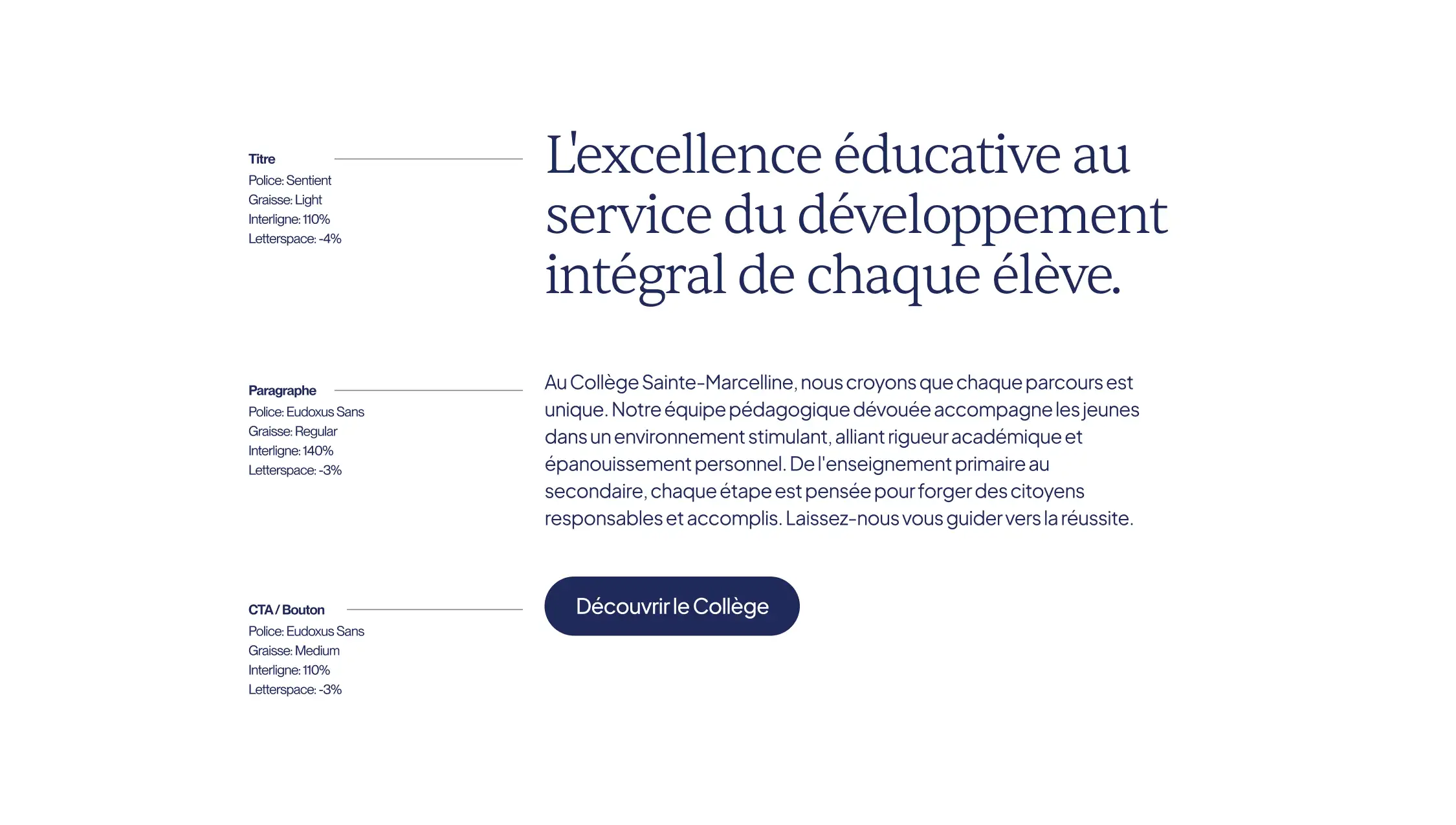
The interface translates the identity into a visual world that is institutional, warm and contemporary. Editorial typography evokes the College’s history and prestige, while a bright colour palette and spacious compositions make the content easy to explore. Authentic photography places students and the community at the heart of the experience. Crest-inspired shapes, graphic details and colour variations create a strong sense of continuity between the brand identity and the website.
Technology development
Built on WordPress, the website uses a flexible structure and custom content blocks, enabling the College’s team to manage content independently while preserving the integrity of the design. The responsive platform was developed according to current accessibility and privacy standards. Its scalable structure will allow the College’s digital presence to evolve alongside its future needs.
Result
Collège Sainte-Marcelline now benefits from a visual identity and digital platform capable of carrying its history into the future. The new ecosystem showcases both the institution’s educational tradition and its forward-thinking programs in artificial intelligence, robotics and intergenerational learning. Clearer, more vibrant and more distinctive, this renewed presence fully expresses the duality at the heart of the College: rising through knowledge and shining through the heart.